top of page
OMUSUBI


OVERVIEW
Bringing the charm of Japanese convenience store food to LA, OMUSUBI reimagines riceballs as a quick, healthy, and approachable option for a diverse audience.
DISCIPLINE
Brand-Identity
UI/UX
Packaging
Print Collateral
Illustration
Signage
DISCIPLINE
Brand-Identity
UI/UX
Packaging
Print Collateral
Signage
Illustration
Animation


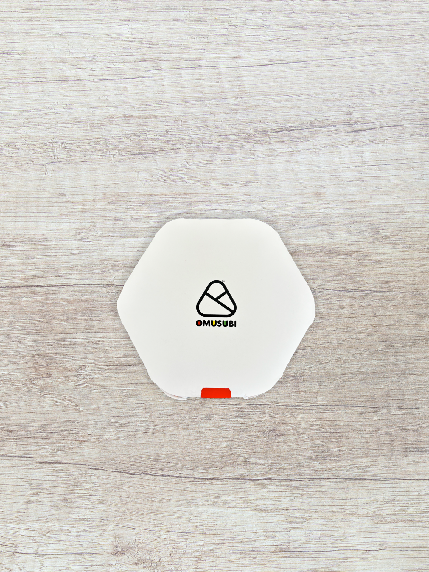
LOGO
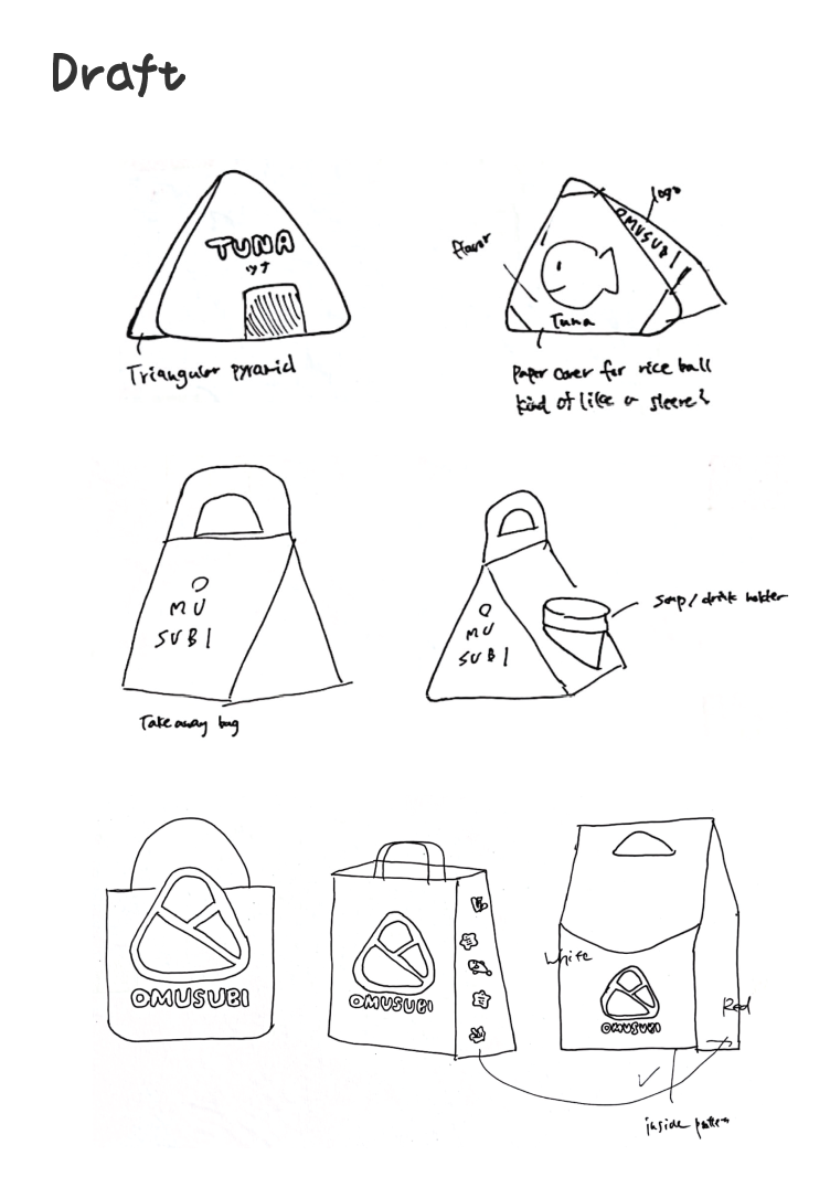
I explored different ways to express the riceball’s triangular form—experimenting with ribbons and abstract shapes. I wanted a design that felt both traditional and modern, so I refined these ideas into a wrap-like element, inspired by Japanese convenience store packaging, to enhance authenticity and recognition.


COLOR PALETTE
Shrine Red and Sakura Pink evoke tradition and warmth, while Kintsugi Gold and Fuji Purple blend craftsmanship with nature to create modern, artisanal appeal.


WEBSITE
A playful web experience that brings OMUSUBI’s personality to life, with bold colors, friendly icons, and a snackable layout.
PACKAGING


PRINT COLLATERAL
Since rice balls are still unfamiliar in the U.S., I designed an interactive “Flavor Finder” menu to simplify choices. By answering three quick questions, customers discover a recommended flavor, with descriptions and suggested sides to ease decision-making and introduce Japanese food in an engaging way.


STORE


TYPOGRAPHY
I selected Domus Titling and Halcom because of their round and friendly forms. Both fonts convey friendliness and modernity, which complements the brand's friendly and comforting personality, much like the rice balls themselves.


ILLUSTRATION


THE ASK
How do you wrap culture, convenience, and comfort into one perfect bite?
MORE WORKS

knekt
Branding for credit card

POINTCLUB App Rebrand
Redesigning the UI/UX for a rewards app

GOODGIRLFISH
Brand extension for wine brand

knekt
Branding for credti card

POINTCLUB App Rebrand
Redesigning the UI/UX for a rewards app
GOOD GIRL FISH
Brand extension for wine brand
bottom of page