top of page

POINTCLUB APP REBRAND

OVERVIEW
The PointClub App was reimagined to make tracking and earning Rakuten Points more fun and engaging. The new design balances simplicity with playfulness, guiding users to interact with points in a more dynamic way.
DISCIPLINE
UI/UX
Creative Direction
Design System
DISCIPLINE
UI/UX
Creative Direction
Design System


THE ASK
How do you make points management
feel like fun, rather than a chore?

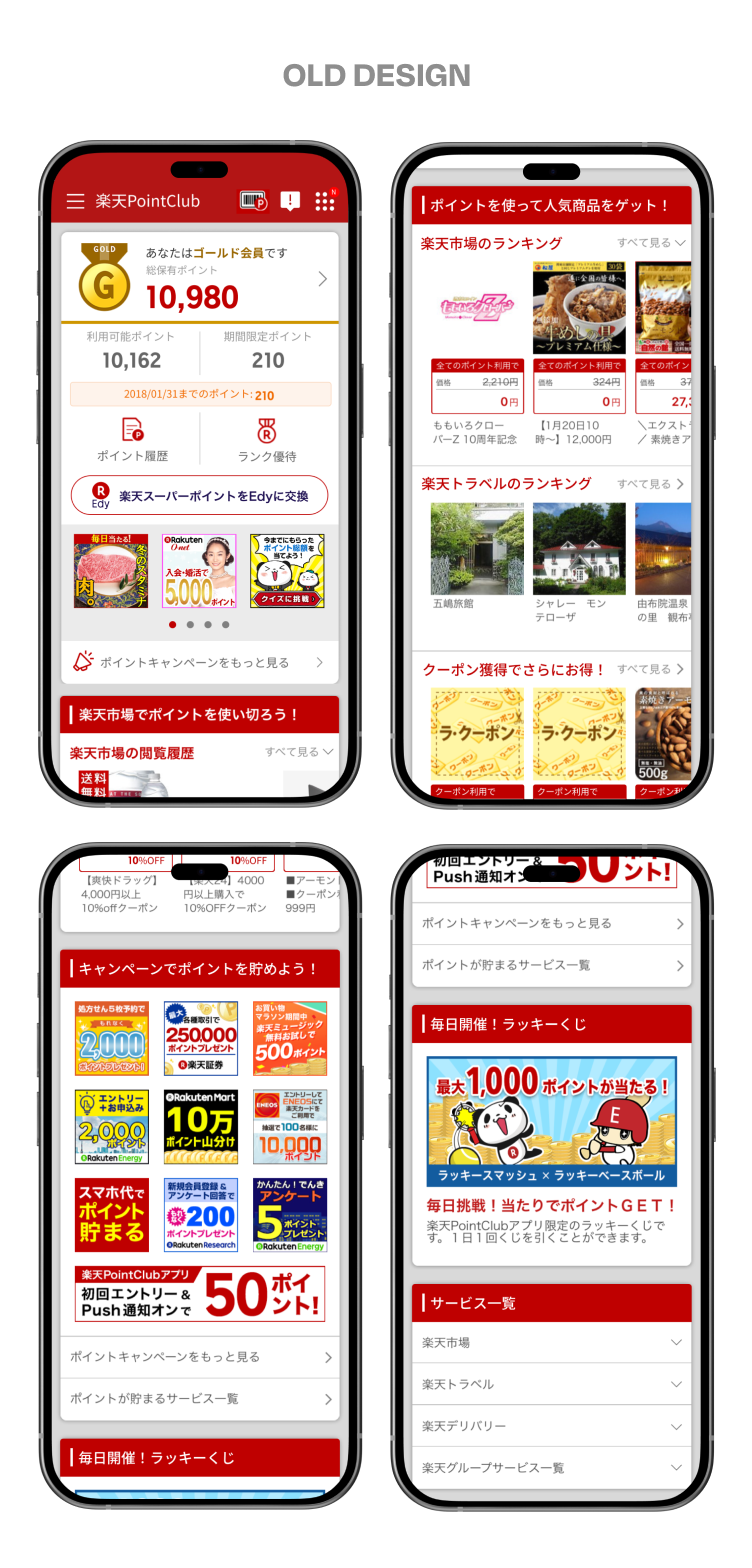
FINAL DESIGN


CONCEPT
Collaborating with the UX team, we defined PointClub’s identity as simple, clean, and modern. A colorful design reflects the app's content, while a fun and engaging feel adds excitement. To boost user interaction, we introduced a Boost Filter during bi-monthly campaigns, making the experience more dynamic.


MOCKUP
As a points management app, I explored the balance between originality and consistency with other services. In order to maintain a sense of uniqueness, I prioritized a unified user experience. Ultimately, we chose the middle concept, which successfully blends originality with consistency.

STYLE GUIDE
I updated the main color to yellow to reflect points, with red accents for Rakuten’s branding. To enhance the system, number-based fonts were introduced to highlight key values, reinforcing the point-collection experience.


STYLE GUIDE
I updated the main color to yellow to reflect points, with red accents for Rakuten’s branding. To enhance the point-based system, I introduced number fonts that highlight key values.


See More
See Less

Launching New Coupon Platform
Developing a new digital coupon system

Character Branding and Experience
Rebranding Rakuten's official social accounts
MORE WORKS

Launching New Coupon Platform
Developing a new digital coupon system

Character Branding and Experience
Creating campaigns and digital experiences for Rakuten Panda
bottom of page